
Welcome to this tutorial for turning your simple title text to rock or stone looking text in 3D. In this guide we will be using Adobe Illustrator in creating this style. This helps you create a vector type art, perfect for scaling these graphics for printed materials such as small booklets and brochures or even large posters, banners and streamers. So just follow the steps below and you will see how you can turn simple typed up text to 3D rock/stone graphics using Adobe Illustrator.
1. Setup a new document or art board to your specified dimensions. For now, keep the background white to make things easier. Just type in the message using the text tool. It is important to choose a font style that is very solid and if possible very stout or fat so that you can make a more convincing 3D rock face.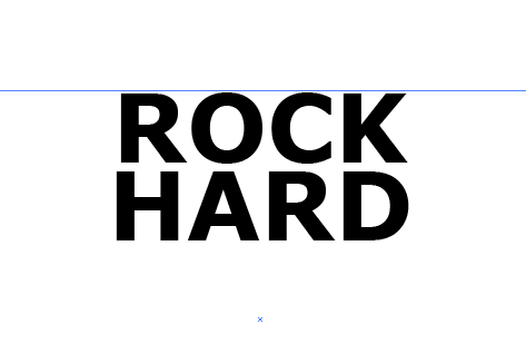
2. Next, select the text and go to Type -> Create Outlines. You should then see the text outlines in your title. Right click on the title and select “Ungroup” to make editing them easier.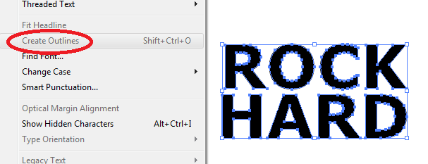
3. Now, we are going to create some breaks, chips or holes in our text. These add the impression that your text is like crumbly rock a bit. To do this, you will want to first create a few random shapes that will be the chips, breaks and holes like so. Merge them if possible by using the pathfinder panel and clicking on the “Unite” option.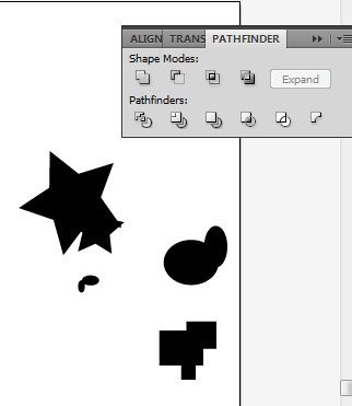
4. Afterward, you will need to distort and cut up these shapes. Use the Add Anchor point tool (Shortcut +) and the Direct Selection Tool (Shortcut A) to distort twist and adjust those basic shapes into more grunge looking spots. Just experiment and be creative.
5. Now, to apply some of these spots and cut out our text, simply copy and drag the shapes unto a letter of your text.
6. Then select both the grunge shape and the text and then go to the pathfinder panel. Click on the option “Minus front”.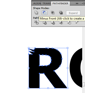
7. You will see that the shape on front will cut out the text shape below.
8. Repeat this step for other spots in your text to make your text title look a bit more crumbly and chipped. Do not overdo this of course. Make sure the shape of the text is still understandable.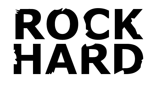
9. Then we will add the 3 dimensional element. To do this, first select all the text characters and right click on them to bring out the context menu. Select “group” to group all the text again.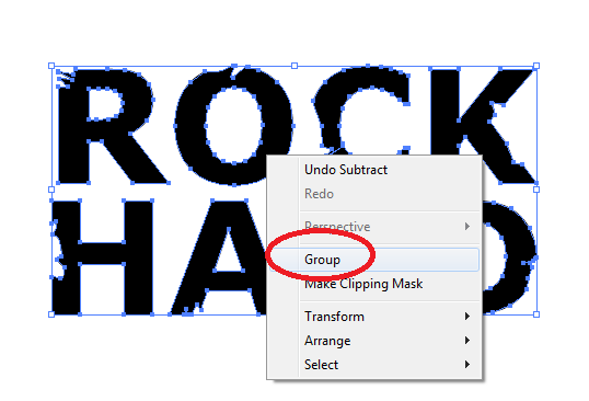
10. Next, go to Effects -> 3D -> Extrude and Bevel.
11. Adjust the angle of the text using the 3D block. Have it facing in front with its back looking extruded at the back of course. Add a very high extrude depth here of around 300-400. Also, use a 111 degree perspective. Once done click on ok.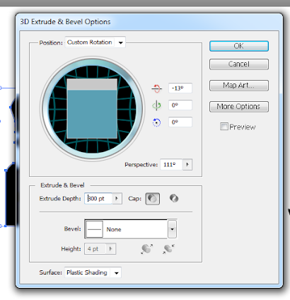
12. Now, depending on the color of your text and its stroke, you will see something like this.
13. To manipulate the different areas of this text and add design styles, first go to Object -> Expand Appearance.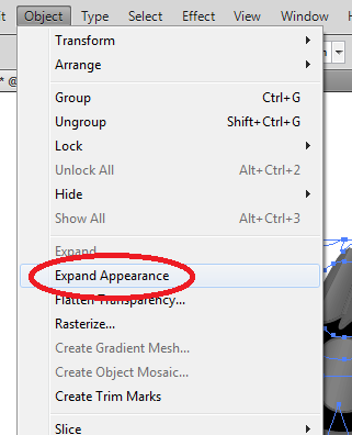
14. Then, right click on the text and select “ungroup”. This lets you select the extruded areas, the type faces, and all the other surfaces in between.
15. If you want the same color style or look for the front faces of your text though, select ONLY THE FRONT of your text shape and then right click on them. Select group now on the context menu. Add the color or color gradient that you want for your text.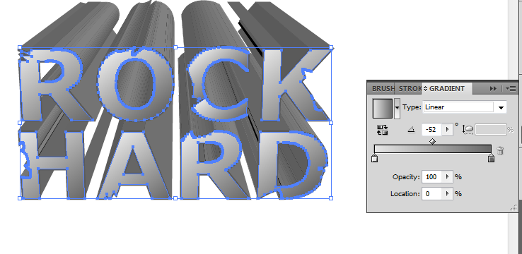
16. Afterward, select the front text part again and copy it by just pressing CTRL+C and CTRL+V. Then with the duplicate go to Effects -> Pixelate -> MezzoTint. Select short strokes as the type for the effect and then press ok.
17. Reduce this shape’s transparency to around 20-30% to add that rock type effect.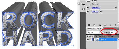
18. Then , for the back extruded part of your text, simple select them and then color them up with a color hue that is darker that your front text. Add a slightly lighter stroke to them, with the same grunge brush that you used earlier.
19. The result is a nicely done rock looking 3D extruded text perfect for specialized designs. Congratulations.
photoshop (8)
If your designs are a bit on the darker side of the color spectrum, you might want to use brighter and more eye catching font styles for your titles. In this tutorial, I will show you how to illuminate your poster or brochure printing designs with Neon text. Let’s get started.
1. Now, with a new document open, make sure to first add a dark background. The bright neon colourful effect won’t be maximized if the background is bright. So go for something dark. It does not necessarily have to be black, it can be a dark grey a deep dark red or something similar. In our example, we have set a background of a gradient, dark red (#410000) to an almost black color (#100000).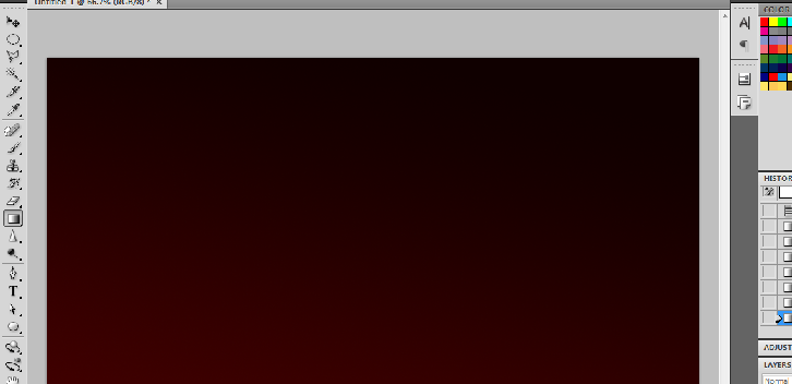
2. Now type in your title text. While of course you can use any font style you like, to pull off a good neon styled effect, it is best to use thinner style fonts. This is because most neon signs of course have thin characters. So if possible try a sans serif font that is thin for your neon titles.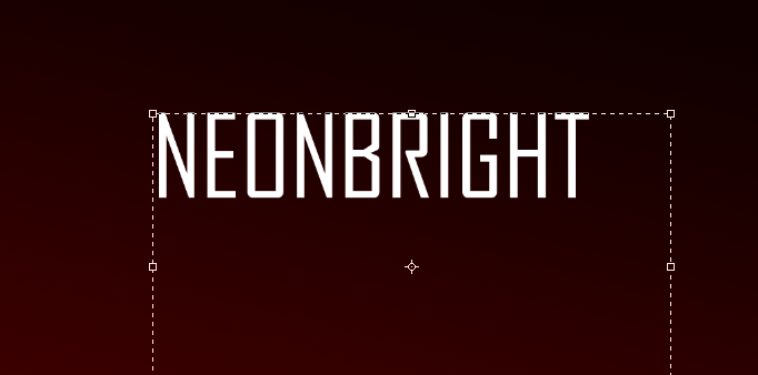
3. Before you continue, first duplicate your text. You can do this easily by right clicking on the original text layer and then choosing “duplicate layer.” Alternatively just press CTRL+J.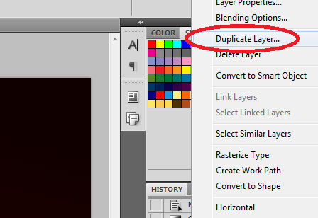
4. Now, hide the duplicate layer for now by clicking on the “Eye” or visibility icon besides its layer name. We will use this later.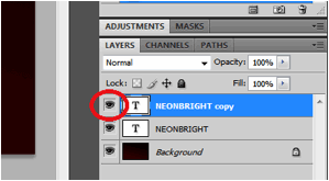
5. Next, double click on the original text layer to bring up its blending options/layer styles. Then, click on the option for “gradient overlay”. To make our neon text look colourful, you will want to use a gradient combination with at most 4-8 different colors (depending on the length of your title). Do this by clicking on the gradient box and then selecting your colors. Also add in the following settings:
a. Blend Mode: Normal
b. Opacity: 60
c. Gradient Color: (Spectrum colors)
d. Style: Linear
e. Angle: 0°
6. That gives us our basic colourful text style.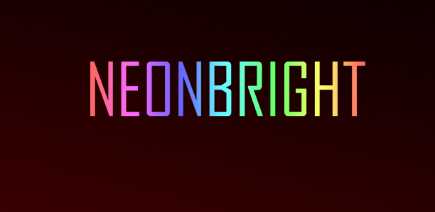
7. Now, we will make things a little bit blurrier to simulate the bright color effect of neon lights. With our layer selected, go to Effects -> Blur -> Gaussian Blur.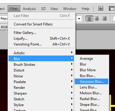
8. A window will appear asking you if you want to “Rasterize” the type. Go ahead and click OK. Once you get to the Gaussian Blur settings add a 4.0 pixel blur radius value. You can of course play with this value if you want but this is a good value to start with for the neon text effect.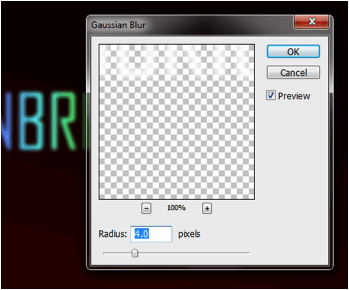
9. Don’t worry if your text turns “too fuzzy”, we will now work with our duplicate layer from before. Make it visible again by clicking on the eye icon. Afterward, apply the Gaussian blur effect again to this layer (Rasterize the type again if asked). This time though, use a 1 pixel blur radius.
10. Now, go to the layer styles and blending options for this duplicate layer. In the main blending options controls. In the Advanced Blending area, slide the Fill Opacity setting to 50%.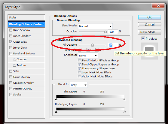
11. Then, click on the “Outer Glow” effect. Apply these settings in its options area:
a. Blend Mode: Color Dodge
b. Opacity: 50%
c. Noise: 0%
d. Color: CHANGE THIS TO WHITE. Just click on the box and then adjust the color to white.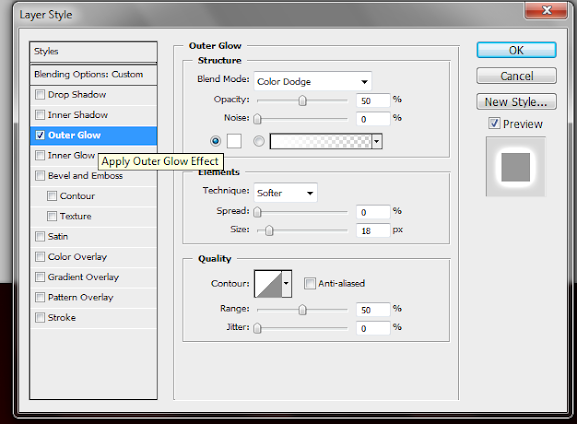
12. Now, if your original text color (that was duplicated here) is White, then you do not have necessarily do this step. Just try to see if you get a better look depending on your font and colors. However, if the original color was not white, then you will want to probably do this. Just click on the color overlay option and change its color to white, Then adjust the opacity to around 50-60%.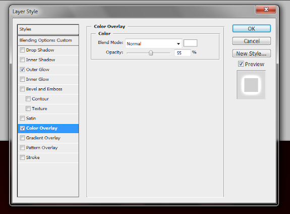
13. Now, you should have a nice looking colourful, neon styled title.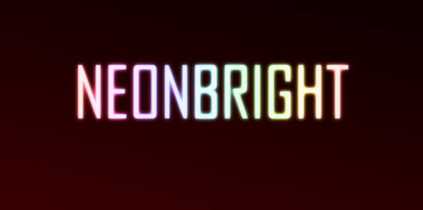
14. Now, you can add your own supporting styles to this by adding reflections, lines and other types of complimentary backgrounds and effects.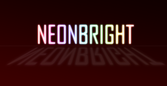
If ever you need a fish graphic for your brochure print, poster or booklet printing designs, it is best to always go vector. Why? Because vectors are easily scalable, with little to no risk of distortions, especially if you want to print them. That is why it is better to learn creating your own graphics in vector form using software like Adobe Illustrator.
In this tutorial, we will teach you how to create your own vector clown fish graphic using Illustrator. It is easy once you know the specific steps that you need to create the vector shapes. Just read the steps carefully below and you will see how easy it is to do graphic vectors for your poster, flyer and booklet designs.
1. With a new document in illustrator open, simply draw a wide style ellipse by using the ellipse tool. Find it in the tools panel and simply click and drag the shape unto the canvass.
2. Now, click on the Direct selection tool.
3. Click on the anchor in one side of the ellipse. Then click on one of its handles. Reduce the scope of the handles by dragging them toward the original anchor. Do this for both handles to create part of the tail.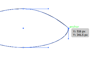
4. Next, do the opposite for the opposite side. Increase the scope of the handles a bit to create the face.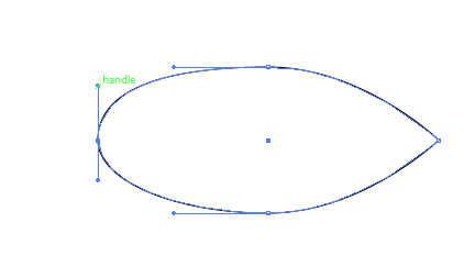
5. Now, let us add an orange color gradient to this shape to establish the body of our clown fish.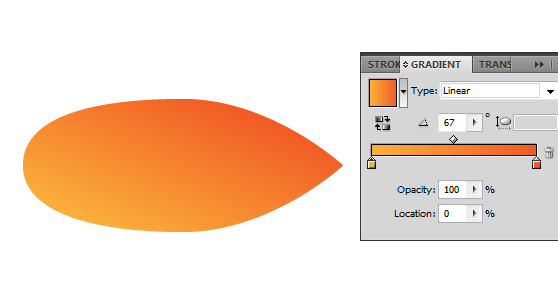
6. Next, we shall add the eyes. Simply draw three circles. One large white circle, one smaller black one, and one even smaller white for the glint of the eyes. Just look at the image below for reference.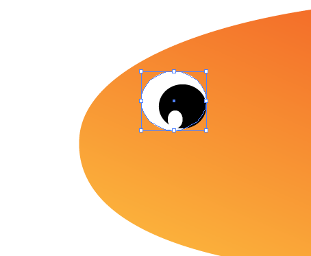
7. Now we shall add white stripes, much like how clown fish have. Use the pen tool to draw a random, oddly figured stripe. Color it white and then place it across the body of our fish.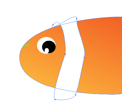
8. Now, with just repeat creating stripes across the body. Add a black stroke to them and the body to make them look more visible.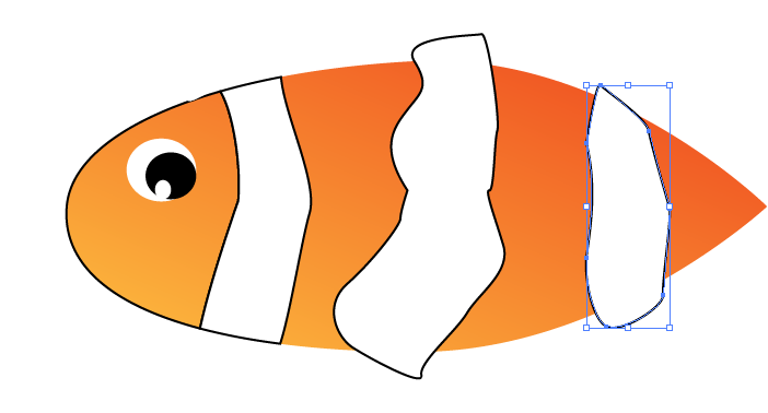
9. Then, select the body and the stripes and click on divide in the pathfinder tool. This will divide your fish body and stripes along with the intersecting paths. Just delete the excess to get the full body correctly. NOTE: when deleting the excess, make sure you “ungroup” the shapes so as not to delete everything.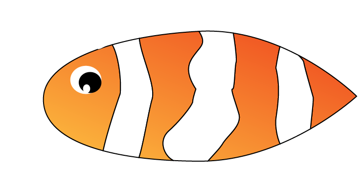
10. Great! Now, just use the pen tool to add the fins and tail. Make sure you color them like the body of course. For the tail, you can merge it with the tail part of the body by just selecting them both and then choosing “unite” in the pathfinder tool.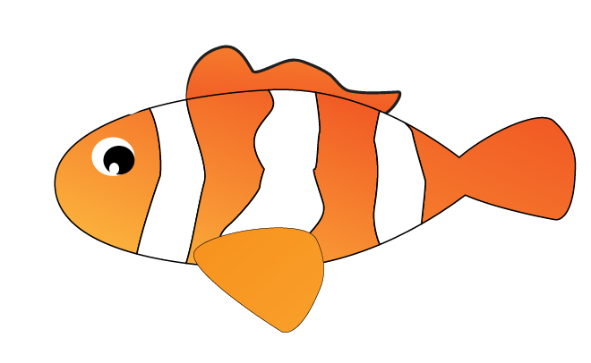
11. Finally, just add a few lines for the fins, and a smile for the mouth to finish our cartoon clown fish.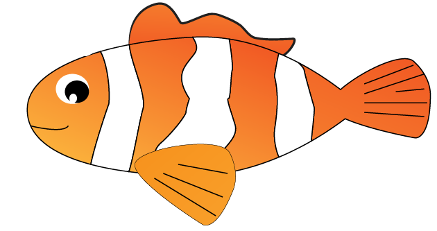
Illustrator has a lot pretty great features that allow you to turn standard vector text into artistic handwritten type artwork. In this tutorial we will go through the steps to help you learn how to do convert your own typical title text designs to exquisite looking handwritten work. You can apply this effect to your posters, magazine ads or even on your web site design. Follow the steps below and you will see the easy step by step process in adding that artistic handwritten look for your text titles. Let us get started.
1. With your new document open, first create a background for your text. Use the rectangle tool to create a fairly large colored area across the art board. For now, fill it with a light grey color of your choice.
2. Next, with the rectangle selected, go to the Appearance panel and click on the option to “Add new fill”. We will add a pattern to this new fill to make the background look a bit like textured paper.
3. Go to your swatches panel and look in the swatches library for patterns. Select a good pattern that will fit your theme for this type of title.
4. Once you have selected a pattern, adjust the transparency of this new fill by selecting it in the appearance panel and adjusting its transparency controls. Do not forget to change its blending mode to multiply as well.
5. Create another rectangle of the same color and size as your original. Place this on top of the current rectangle and then adjust its opacity to only 35%.
6. Afterwards, go to Effects -> Artistic -> Film grain to add a grainier texture to this layer.
7. Next create another rectangle of the same size and color as the original. Add a black to white radial gradient with the dark patch in the middle for this layer.
8. Then go to the transparency panel with this shape selected and click on the top right menu. Select “make opacity mask”.
9. Now we have a good background texture for our text.
10. Type in your title text now. Make sure that you are using a font style that looks a bit like it was handwritten of course. It should be a bit large or fat though so that you can see a more solid type of text. Color it what you need for your title.
11. Afterwards, go to Object -> Expand. You will see that your text becomes real shapes instead of text vectors. Select them all and go to Object -> Compound Path -> Make.

12. Now, select the path. Go to the appearance panel and then select the fill of this path. Then apply the effect scribble on it. Go to Effects -> Stylize -> Scribble.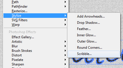
13. Use custom settings for the scribble options. Add a 30% angle, 0 pixel path overlap with 5 pixel variation, a 0.5pixel stroke width with 5% variation, 1.5 pixel spacing with 0% variation. Press OK once done.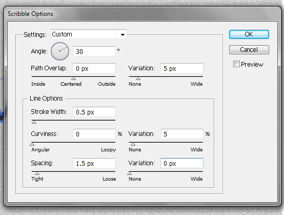
14. Great! Now you have a text with a scribble effect on it.
15. Now we will add some effects on the edges of the text to make them even more hand designed. To do this, we will create art brushes. To do this, go to Windows -> Brushes to open the brushes window.
16. Next, activate the ellipse tool in the tools panel and click on the art board. Use a 10 value for the width and a 1 value for the height. This gives us an ellipse of those dimensions. Fill it with the color that you want. Then activate the Convert Anchor Point tool (shortcut SHIFT+C) and then click on one side of our shape. This gives us the shape below.
17. Once done, go to the brushes panel and click the menu on the top right of its panel. Click on “New Brush” and select “Art Brush”. Afterwards, adjust the values of the brush as you see fit. Just use the option to stretch to fit stroke length for this brush and a 100% fixed width. Customize the other values as you want.
18. You can create as many art brushes like this as you like with different lengths, shapes and sizes. Just be creative with this as you want. For our example though, we will create 4 more with these values below. Simply substitute these values as you repeat steps 14 to 15.
a. Brush 02: Width 10, Height 1.8 with pointed right edge using the Convert Anchor Point too.
b. Brush 03: Width 10, Height 2.8 with pointed right edge using the Convert Anchor Point too.
c. Brush 04: Width 10, Height 3.9 with rounded edges that is standard in the ellipse
d. Brush 05: Width 10, Height 2.8 with pointed right edge using the Convert Anchor Point too.
19. Great now we will use these art brushes in our text. Select the text path. With the brushes panel open, select Art Brush 5 to add it into the path. You will then see a little bit of what our end result will be like. This effect certainly adds a bit of flair when brochure printing or booklet printing.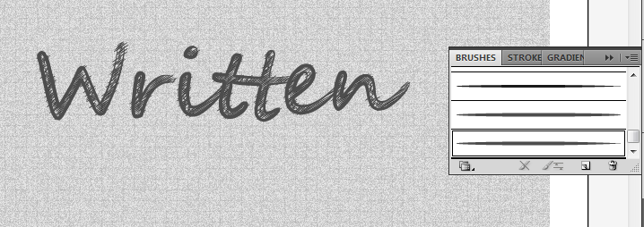
20. Afterwards, open the appearance panel. Look for the stroke attribute with the brush that we applied. Duplicate this stroke by clicking on the duplicate button below the panel. With the duplicate selected change the stroke to Art Brush 1. This helps fill out the areas that the art brush 5 did not cover.
21. Next, using the Brush tool in your tools panel, use Art Brush 3 and paint some of the rounder areas of your text.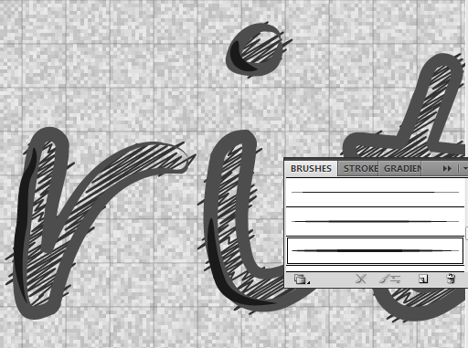
22. That should finish the standard effects that we can put into our "handwritten text".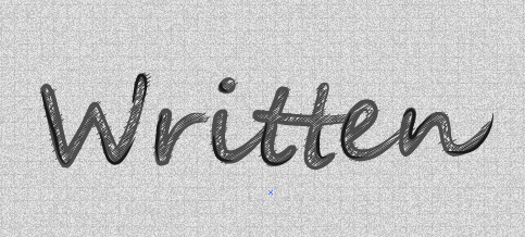
23. However, you can still make things more creative by using the Art Brush 2, 3, 4 and 5 in the different corners and spots in your text. Just add some extra curves, frills and accents. Remember to use varying shades of your base theme color to make things look interesting.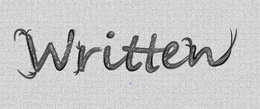
24. If you are inspired enough and creative enough you have a great text title with handwritten accents like this. Good Luck!
If ever you need a fish graphic for your brochure print, poster or booklet printing designs, it is best to always go vector. Why? Because vectors are easily scalable, with little to no risk of distortions, especially if you want to print them. That is why it is better to learn creating your own graphics in vector form using software like Adobe Illustrator.
In this tutorial, we will teach you how to create your own vector clown fish graphic using Illustrator. It is easy once you know the specific steps that you need to create the vector shapes. Just read the steps carefully below and you will see how easy it is to do graphic vectors for your poster, flyer and booklet designs.
1. With a new document in illustrator open, simply draw a wide style ellipse by using the ellipse tool. Find it in the tools panel and simply click and drag the shape unto the canvass.
2. Now, click on the Direct selection tool.
3. Click on the anchor in one side of the ellipse. Then click on one of its handles. Reduce the scope of the handles by dragging them toward the original anchor. Do this for both handles to create part of the tail.
4. Next, do the opposite for the opposite side. Increase the scope of the handles a bit to create the face.
5. Now, let us add an orange color gradient to this shape to establish the body of our clown fish.
6. Next, we shall add the eyes. Simply draw three circles. One large white circle, one smaller black one, and one even smaller white for the glint of the eyes. Just look at the image below for reference.
7. Now we shall add white stripes, much like how clown fish have. Use the pen tool to draw a random, oddly figured stripe. Color it white and then place it across the body of our fish.
8. Now, with just repeat creating stripes across the body. Add a black stroke to them and the body to make them look more visible.
9. Then, select the body and the stripes and click on divide in the pathfinder tool. This will divide your fish body and stripes along with the intersecting paths. Just delete the excess to get the full body correctly. NOTE: when deleting the excess, make sure you “ungroup” the shapes so as not to delete everything.
10. Great! Now, just use the pen tool to add the fins and tail. Make sure you color them like the body of course. For the tail, you can merge it with the tail part of the body by just selecting them both and then choosing “unite” in the pathfinder tool.
11. Finally, just add a few lines for the fins, and a smile for the mouth to finish our cartoon clown fish.
Price tags are a common graphic art that is used for many different marketing prints such as in brochure printing, and booklet printing. Now with the easy tools that you can get from illustrator, you yourself can create your own great looking vector price tag graphics easily. Let me teach the basics in creating a good looking vector price tag for your printed graphic. Let us first start with creating the main rectangle.
1. Start by selecting the rectangle tool in the tools window.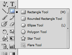
2. Next, click and drag over the canvass to start drawing your rectangle.
3. Adjust the color of your rectangle when necessary by selecting its color options.
4. Next, add a new anchor point to our rectangle. Just go to your tool window and select the “Add Anchor Point Tool”.
5. Since many price tags have pointed edges an one side, we will prepare this by adding one anchor point at the end of the rectangle, in the middle of the two sides.
6. Once the anchor is placed, select the “Direct selection” tool in the tools window.
7. Grab the new anchor point we made and drag it outwards. You should see our basic price tag shape form.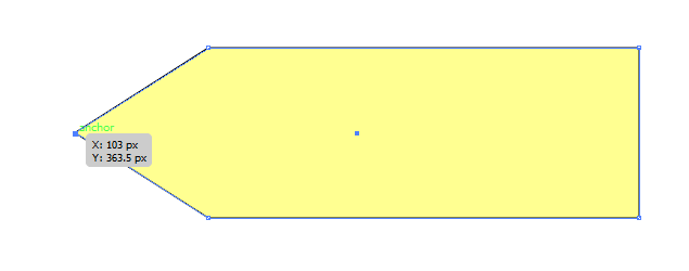
8. Next, let us simulate some borders around the price tag. Use the selection tool (shortcut V) and simply press CTRL+C and then CTRL+V to duplicate our base layer.
9. Change its color to a lighter color and resize it a bit smaller than the original.
10. Place it back on top of our main image to get the border effect.
11. Enhance the border effect by adding a dotted stroke. Just select our smaller shape, and then change its stroke properties to 1px dotted. Make sure you choose a color that is fully contrasting to the background.
12. You should get a result like this:
13. Now, select the larger rectangle again. Adjust its fill and turn it into a gradient. You can do this through the gradient panel. Just make sure you choose the right color that blends well.
14. Next, we shall add the price tag hole. Just use the ellipse tool to create a whole. Color it with the color of your background of course.
15. Then, we shall add some dotted strokes to further enhance this circle as well.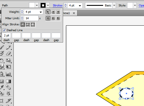
16. Let us add a shadow effect as well beneath the price tag. Duplicate the original shape that we had (CTRL+C then CTRL+V) and then change its color to a full black.
17. Send it behind by issuing the “send to back” command several times. Just right click and then select send to back or press CTRL+ [ several times. Position it so that it looks a bit like a shadow.
18. Finally, let us add our price text. Simply select the text tool and type in the price that you want.
19. It would be better of course for you to use fonts that look a bit like system or simple fonts used for price tags.
20. Great! Now you are ready to use these price tags for any of your designs!
21. Just change the colours to match your needs.
The Clover Leaf, especially the four leaf clover is a symbol of luck. This is a great addition to your digital or print designs, if you are aiming for that lucky, nature like covers. This applies not only for headers and banners, but also for booklet printing, catalogues and brochure printing as well. If you want your own original creation of a clover leaf, then you have come to the right place. We will review here the step by step procedures in creating Clover leaves in illustrator. If you follow these instructions, then you can also create your own vector type clover leaf for your booklet covers or digital print headers.
1. First create a new document. Set your new document profile appropriately if you are using the graphic for web distribution or print distribution. Set your units as pixels or even points if you like that. Once you are done press ok.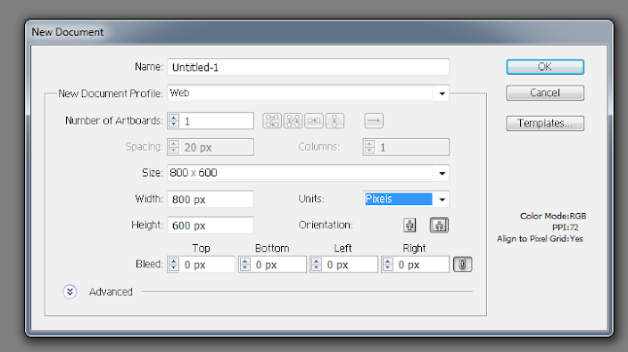
2. Then, before you start drawing, let us start by setting your Fill and stroke values. In the Control Bar, simply select “NONE” as your fill colour, and leave your Stroke to a black colour.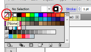
3. Then, select the ellipse tool in your tools window to start drawing some circles.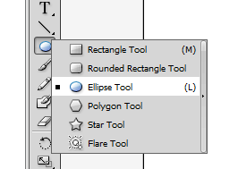
4. Click on a point on your canvass and then select 200px by 200px as your dimensions for your circle.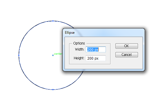
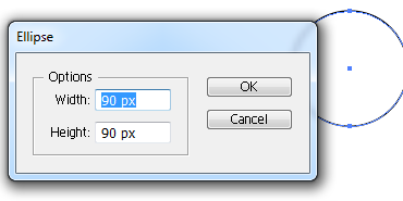
5. Next, create 2 more circles along with this one. Use 125 pixels on the first one, and then 90 pixels on the second one.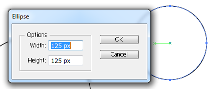
6. Now, combine your three circles. Just move them by using the Selection tool.
7. Combine them into 3 overlapping rings like the graphic you see below. This will be the base for our leaf in the clover.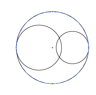
8. Next, click and hold onto the Pen tool and choose the option “Convert Anchor Point tool”.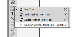
9. Select the largest circle’s bottom anchor point and click/drag it a bit down. You will see that your big circle gets a pointy end in the bottom.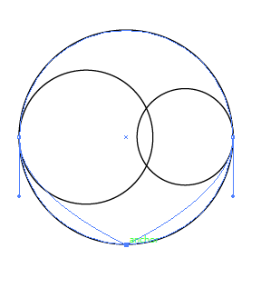
10. Extend the pointy end even further by selecting the Direct selection tool in your tools window.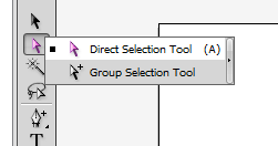
11. Click and drag the bottom anchor point a bit more downwards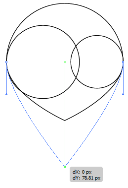
12. Afterward, select all your circles. Then, open the pathfinder window. If you do not see this window, it is in Windows -> Pathfinder. Click on “Divide” .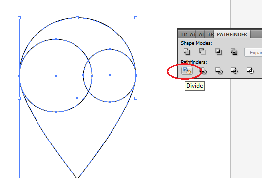
13. Afterwards, right click on your whole selection and then choose the option “Ungroup” from the context menu.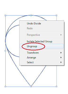
14. Next, using the DIRECT selection tool, just click on the top anchor point and press “Delete” on the keyboard.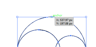
15. Afterward, go back to the Pathfinder tool and select the Unite Option to combine your shapes.
16. We will then get our first Leaf shape for the clover.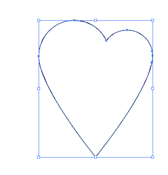
17. Add a fill colour of green to this shape to get your first leaf ready. You should also go for a darker green stroke if you like.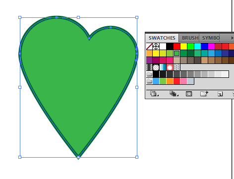
18. Then duplicate this leaf shape by pressing CTRL+C and CTRL+V. Do this two times.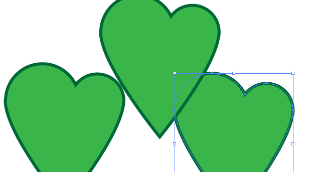
19. Just, right mouse click on those new copies of the life and rotate them by choosing the option Transform -> Rotate…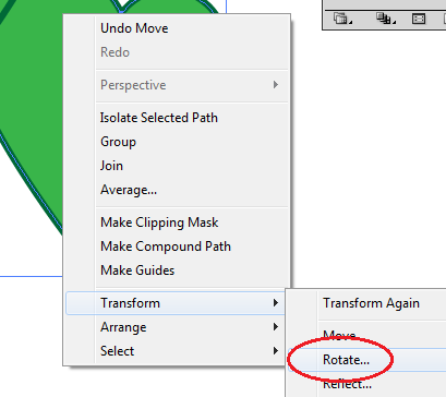
20. Set one leaf to rotate at 90 degrees, while the other must be set to -90 degrees.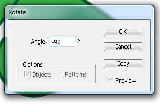
21. Then, just position your leaves accordingly to form the clover shape as you can see below.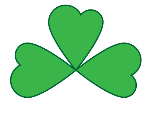
22. Finally, use the pen tool to create the stem.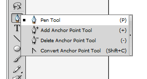
23. Just create a slight curve to make things look natural.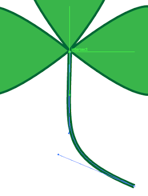
24. Great! Now you have a nice clover leaf. Just style it any way you like for your design theme.
Do you need to create your own custom made CD or DVD graphic for your digital or printed copy designs? While it may look complicated, replicating the look and feel of a DVD or CD item is actually fairly easy to do. This guide will show you the step by step process in creating one using Illustrator. So if you need a DVD graphic for your web designs, or print designs for booklet printing and brochure printing, then these are the steps that you should try to follow.
1. With a new document open, select the ellipse tool in the tools window.
2. Draw a circle in your canvass. Make sure it is sized right for your purpose as the base shape for the CD or DVD graphic. To make sure it is a perfect circle, hold down the shift key as you create it.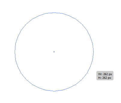
3. Now duplicate this new circle. Just Press CTRL+C and then CTRL+V to create an exact duplicate of our original circle.
4. Next, right click on the new circle and select Transform -> Scale…
5. Scale this new circle as with 95% of the original size.
6. Once done, you will have the smaller circle easily scaled down with the right proportions. Place it at the center of our CD graphic.
7. Next, duplicate the process three more times, using the larger circle as the base. Scale the other circles 30%, 20% and 15% respectively. Position them at the centre to get the desired effect.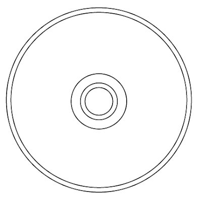
8. Select the second to the largest circle and add the gradient colour in it. Use a white-lightgrey-white gradient combination. Also adjust the degree for the gradient to 45 degrees.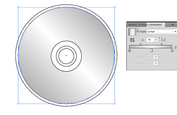
9. For Strokes, Choose a grey 1 pixel for the 2nd largest circle, and a light grey .5 pixel stroke for the largest circle.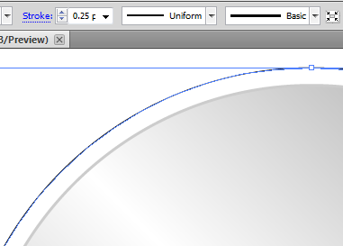
10. Next, for the third circle, add a grey, white and grey gradient colour with 0 degrees angle. Use a 0.5px stroke for this circle.
11. For the fourth circle, use a light grey stroke at 1 pixel, but use a white fill.
12. For the fifth circle, use a light grey stroke at one pixel, but use no Fill.
13. Next, go back to our 2nd to the largest circle and duplicate it. Add a colour gradient with Red, Orange, Yellow, Green, Blue, Indigo and Violet.
14. Send it backward several times. Just right click on it, and then select Arrange->Send Backward. Keep doing it until you have reached this point. If it turned grey, you have gone too far and must bring the circle on layer on top.
15. Next, select Effect -> Stylize -> Feather to make the edges of this circle fuzzy.
16. Choose a 30pixel feather and press ok.
17. Finally, change the opacity of this colour layer. Reduce it to 25%, and use a normal blending method.
18. Once done, you should have a great looking CD/DVD graphic all your own.
19. Do not forget to group this set of circles so that you can easily manipulate them for your purpose. Select all the circles, right click on them and select group.
20. Now you can manipulate them easily. You can try changing their angles, or adding drop shadows. It all depends on your purpose.