
Illustrator has a lot pretty great features that allow you to turn standard vector text into artistic handwritten type artwork. In this tutorial we will go through the steps to help you learn how to do convert your own typical title text designs to exquisite looking handwritten work. You can apply this effect to your posters, magazine ads or even on your web site design. Follow the steps below and you will see the easy step by step process in adding that artistic handwritten look for your text titles. Let us get started.
1. With your new document open, first create a background for your text. Use the rectangle tool to create a fairly large colored area across the art board. For now, fill it with a light grey color of your choice.
2. Next, with the rectangle selected, go to the Appearance panel and click on the option to “Add new fill”. We will add a pattern to this new fill to make the background look a bit like textured paper.
3. Go to your swatches panel and look in the swatches library for patterns. Select a good pattern that will fit your theme for this type of title.
4. Once you have selected a pattern, adjust the transparency of this new fill by selecting it in the appearance panel and adjusting its transparency controls. Do not forget to change its blending mode to multiply as well.
5. Create another rectangle of the same color and size as your original. Place this on top of the current rectangle and then adjust its opacity to only 35%.
6. Afterwards, go to Effects -> Artistic -> Film grain to add a grainier texture to this layer.
7. Next create another rectangle of the same size and color as the original. Add a black to white radial gradient with the dark patch in the middle for this layer.
8. Then go to the transparency panel with this shape selected and click on the top right menu. Select “make opacity mask”.
9. Now we have a good background texture for our text.
10. Type in your title text now. Make sure that you are using a font style that looks a bit like it was handwritten of course. It should be a bit large or fat though so that you can see a more solid type of text. Color it what you need for your title.
11. Afterwards, go to Object -> Expand. You will see that your text becomes real shapes instead of text vectors. Select them all and go to Object -> Compound Path -> Make.

12. Now, select the path. Go to the appearance panel and then select the fill of this path. Then apply the effect scribble on it. Go to Effects -> Stylize -> Scribble.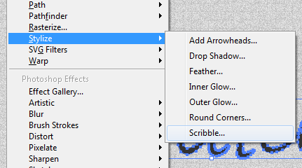
13. Use custom settings for the scribble options. Add a 30% angle, 0 pixel path overlap with 5 pixel variation, a 0.5pixel stroke width with 5% variation, 1.5 pixel spacing with 0% variation. Press OK once done.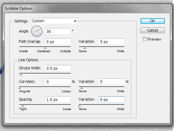
14. Great! Now you have a text with a scribble effect on it.
15. Now we will add some effects on the edges of the text to make them even more hand designed. To do this, we will create art brushes. To do this, go to Windows -> Brushes to open the brushes window.
16. Next, activate the ellipse tool in the tools panel and click on the art board. Use a 10 value for the width and a 1 value for the height. This gives us an ellipse of those dimensions. Fill it with the color that you want. Then activate the Convert Anchor Point tool (shortcut SHIFT+C) and then click on one side of our shape. This gives us the shape below.
17. Once done, go to the brushes panel and click the menu on the top right of its panel. Click on “New Brush” and select “Art Brush”. Afterwards, adjust the values of the brush as you see fit. Just use the option to stretch to fit stroke length for this brush and a 100% fixed width. Customize the other values as you want.
18. You can create as many art brushes like this as you like with different lengths, shapes and sizes. Just be creative with this as you want. For our example though, we will create 4 more with these values below. Simply substitute these values as you repeat steps 14 to 15.
a. Brush 02: Width 10, Height 1.8 with pointed right edge using the Convert Anchor Point too.
b. Brush 03: Width 10, Height 2.8 with pointed right edge using the Convert Anchor Point too.
c. Brush 04: Width 10, Height 3.9 with rounded edges that is standard in the ellipse
d. Brush 05: Width 10, Height 2.8 with pointed right edge using the Convert Anchor Point too.
19. Great now we will use these art brushes in our text. Select the text path. With the brushes panel open, select Art Brush 5 to add it into the path. You will then see a little bit of what our end result will be like. This effect certainly adds a bit of flair when brochure printing or booklet printing.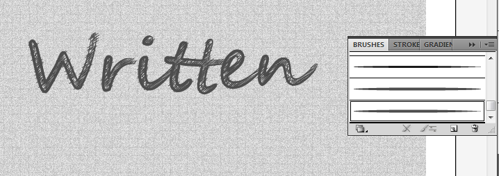
20. Afterwards, open the appearance panel. Look for the stroke attribute with the brush that we applied. Duplicate this stroke by clicking on the duplicate button below the panel. With the duplicate selected change the stroke to Art Brush 1. This helps fill out the areas that the art brush 5 did not cover.
21. Next, using the Brush tool in your tools panel, use Art Brush 3 and paint some of the rounder areas of your text.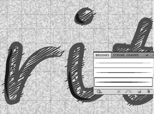
22. That should finish the standard effects that we can put into our "handwritten text".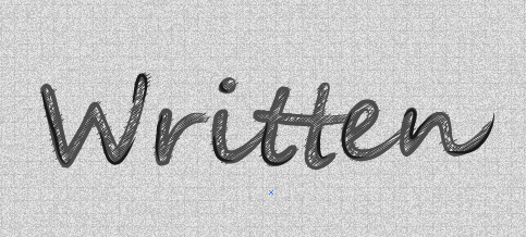
23. However, you can still make things more creative by using the Art Brush 2, 3, 4 and 5 in the different corners and spots in your text. Just add some extra curves, frills and accents. Remember to use varying shades of your base theme color to make things look interesting.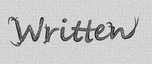
24. If you are inspired enough and creative enough you have a great text title with handwritten accents like this. Good Luck!
You need to be a member of Maoliworld to add comments!
Comments